Teachme TV: Connecting teachers and parents to learning enrichment tools
An E-learning Platform Seeking to Capture Conversions By Improving Landing Pages and Parent Portals.
TeachME TV New Landing Page for Educators
ROLE: UX Design, user research and testing, wireframing
Team: KARAN KUMAR, LAUREN NIPPER
DURATION: 3 WEEKS - NOV 2023
PROJECT TYPE: DESKTOP AND MOBILE DESIGN WITH HANDOFF
TOOLS USED: FIGMA, GOOGLE DRIVE, ZOOM, SLACK, trello
Project Overview
Our challenge in this project was to help TeachME TV convert visitors to subscribers by creating a welcoming and clear narrative that their e-learning platform is made for education enrichment in the classroom and helpful for parents at home. Along with my colleagues, I conducted research and usability testing to backup our hypothesis that more direct information architecture and clearer branding language would result in longer visits to the page and hopefully an increase in subscriptions.
problem statements
for educators
Gertrude, a busy parent of two, wants to find an e-learning website for her kids that encourages independent and fun learning with the ability to track their progress to ensure their screen time is productive.
for parents
Jenny, a 5th grade teacher, needs an e-learning platform to assign work to her students and post updates and alerts for parents so she can focus on her students’ progress.
HOw might we…
Help teachers create class alerts for parents and students?
Contribute to a brand statement of learning, curiosity, and reputability?
Help convert parents and teachers to subscirbers?
Research
Learning from competetors
Strong connection with mission statement, philosophy, and activities offered
Great job at giving a glimpse of what is offered
Great job establishing trust based on accolades, credentials, and quotes
Organized Information
Separate pages in navigation bar
Larger variety of material samples
Shorter pages (less scrolling)
Information given in digestible chunks
INTERVIEW FINDINGS
I co-wrote our script for both teachers and parents and conducted 3 of 6 interviews to determine major pain points and needs for at home and classroom use of e-learning platforms; both groups value intuitive design, efficiency, and clarity so they can trust their kids are in good hands to stay engaged and make progress.
personas
our users gertrude and Jenny
We built our user personas for two users: the teacher and the parent - both with similar pain points but different needs. Gertrude needs a site that allows her kids to learn indipenatntly with fun and engaging content, and Jenny needs a way to track her students success and progress.
journey map
A journey map for the parent user shows that the biggest area that paint points arise information architecture and navigating a site that is overwhelming.
user flow
navigating landing and portal pages
In the first user flow we mapped out the teachers experience; reading reviews, mission statement, and membership plans with Jenny finally converting to a payed subscriber.
For Gertrude, the focus is on signing into the parent portal and checking in on her child’s progress - this ended up not being as much a priority as the teacher flow in a late pivot with the client, who wanted more attention paid to the educators and districts viewing the site.
ideation and conceptualization
SKetches
educator/parent portal
Landing page
about
portal data
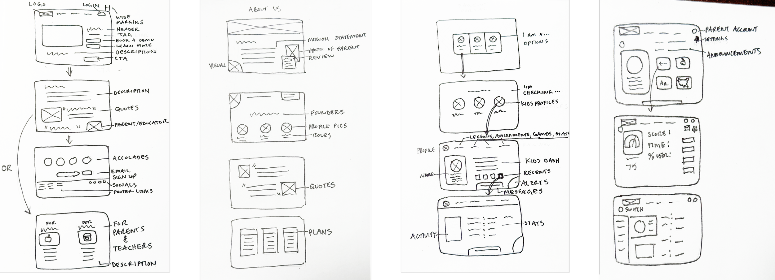
For the landing page and about pages we wanted to include as much content that would promote trust in the brand and mission as possible, highlighting the accolades won, reviews, and copy that illustrates the value of subscribing.
For the portal I sketched out ideas of what it would look like to choose between users, select different students who the user would be checking in on, and educational metrics that could be represented in an accessible and legible way.
design and prototype
framing the solution
Low fi wireframe
Mid fi wireframe
High fi wireframe
We translated out sketches into wireframes with emphasis on margins, playful doodles to invoke and educational setting, and focus on hierarchy of important branding copy without overwhelming the user. For high fidelity I selected playful icons for the subjects and we held a design studio to establish the color and typography guide.
testing and validation
usability testing
Usability testing gave us important insight into scrolling limits, global navigation and information architecture. It also told us how users view and interpret membership plans when presented with several options.
Task One: How would you go about discovering what TeachME TV has to offer?
Average completion time: 0:33
100% of users completed each task with only one error per task
Task Two: How would you buy a membership?
Average completion time: 0:26
66% of users diverted to About Us page to find information
development and implementation
style guide
Our style guide was based on TeachME TV’s existing logo with additional bright colors used to invoke playfulness, education, and strength. We used Patrick Hand as our main type to keep it clean and youthful with Raleway for our microcopy and bulleted points that needed to be quickly digestible. Both are accessible and legible. It was also important to create type hierarchy among the heavy use of text so our parents and teachers didn’t miss a thing.
prototype
Next Steps
Parent-teacher messaging system
Build out kids zone to connect to games
Add animations to match library and encourage an interactive experience.
key takeaways
The client had very specific ideas of how copy should be inviting and encouraging to the user; we made sure that using hierarchy and targeted copy, we are promoting the brand and leading towards conversions as much as possible.
Teachers who are parents have very separate hats they wear when it comes to monitoring and checking on progress for their kids vs their students. It was important to make our usability and interview scripts definitive and catering to both.
Our team worked incredibly together, splitting work evenly and arriving at solutions thru design studios and collaboration. I was proud to be their team mate.


