KINDLE: Sparking Conversations by Connecting Mobile Readers
Project Overview
Role: UX Design, User Research, Usability Testing, Prototyping
Team mates: Devon Bower, Gaozong Yang
Duration: 3 weeks - October 2023
Project: Mobile design
Tools used: Figma, Google Drive, Zoom, Slack, Canva
As part of a 3-member team engaging in a 3-week sprint, I contributed to the research, synthesis, and design of Amazon’s famous reading platform - The Kindle. For it’s companion app I, along with my team mates, created social features to help connect readers and engage with each other over their favorite books, quotes, and genres.
Problem Statement
Connecting Core Readers
Reading can be isolating. Mostly done alone, a reader often seeks out book clubs or social groups to discuss their books or plays with others. In our case study, users wanted a way to interact with other book lovers on the Kindle app without compromising their core reading experience.
Research
Getting on the Same Page
For our research we conducted user interviews to establish our readers’ core needs and pain points when reading on their Kindle and using the app, and also when interacting with their friends and literary community. For this phase, I conducted 2 of 6 interviews and participated in affinity mapping and selecting which products would be included in our feature inventory - then handed off to my team.
Ideation and Conceptualization
Building A Site Map
I participated in building a site map for the current app and it’s contents as well as an an future iteration with improved navigation based off our research feedback. From there, we made quick work of a social user flow and began to sketch.
Design and Prototype
A Funny Thing Happened on the Way to the Online Forum
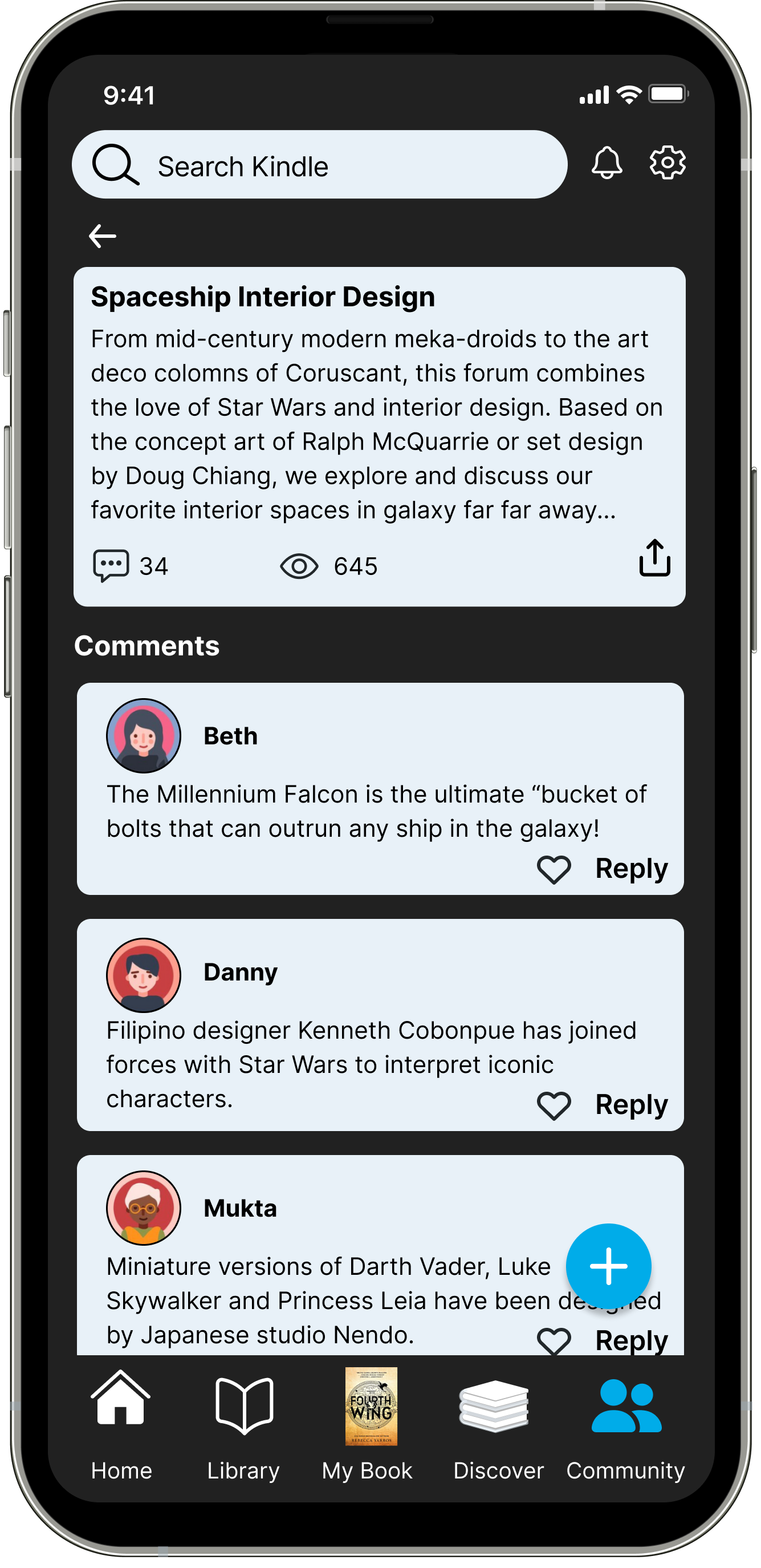
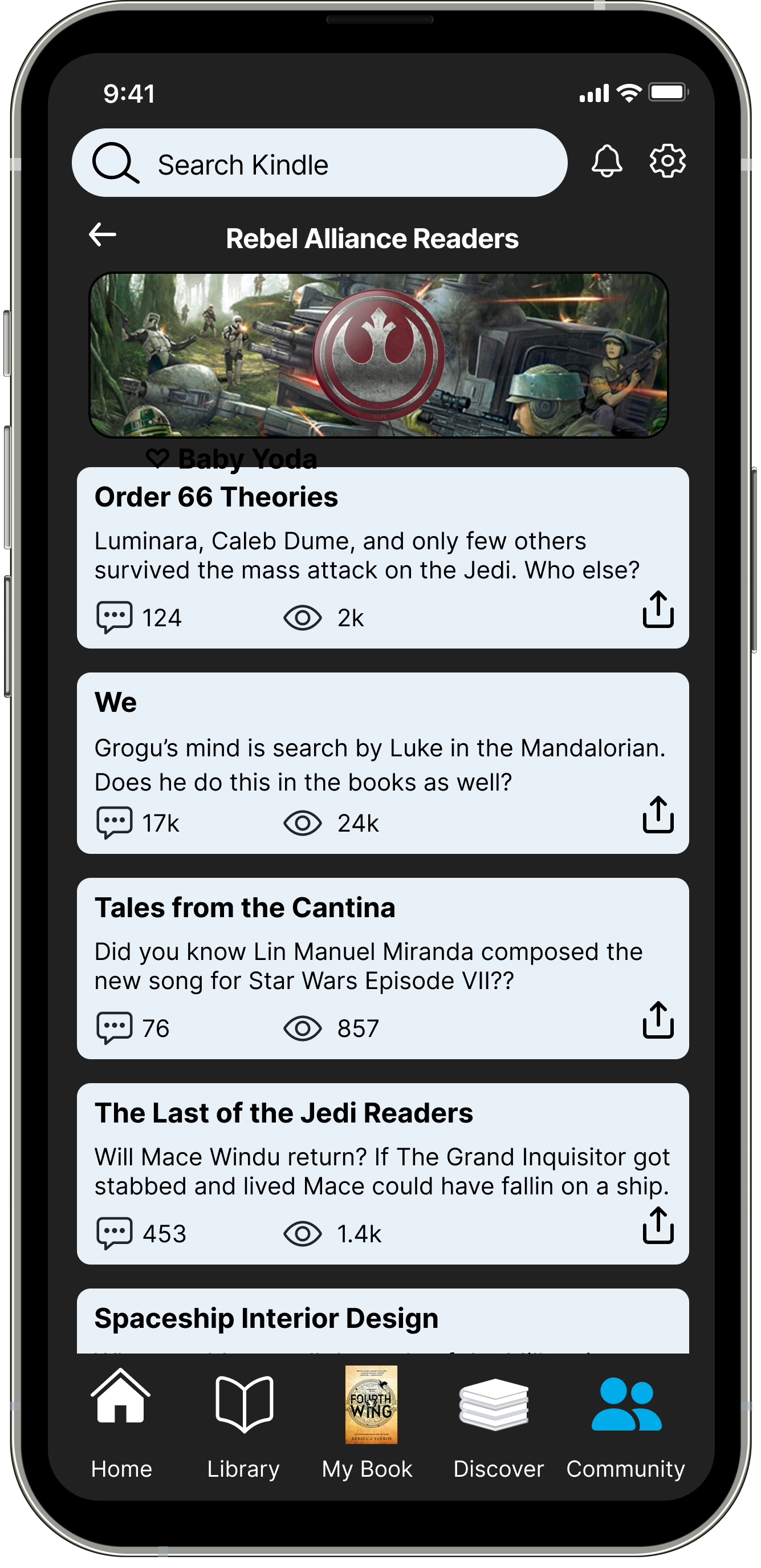
Our sketches were done individually and then the best ideas were chosen by unanimous consensus for further mid framing. We focused on the footer; redesigning the order of My Book, Library, and the new Connect features. We Built out the social icons for the reader to choose between groups, favorites, friends, and saved quotes. Finally, we designed how groups within the app would function with regard to scrolling posts and discussion forums.
I designed social icons for the connect feature, the footer layout and contents with my team mates, and helped create components for the galleries, buttons, and footers.
Click through Prototype
Testing
She’s An Icon
To asses users’ satisfaction with our mid fidelity prototype, specifically the social function and it’s accessibility and ease of use, we put it through usability testing of 5 users with the task of joining a social group and leaving a comment.
3/5 users were confused by (favorite)
5/5 didn’t know where comments would be posted
2/5 misunderstood the comment as a chat feature (chat)
Development and Implimentation
Group Work Flip It and Reverse It
Our team functioned as a three person engine - each taking turns fueling the process with materials and new ideas.
I created the homepage library contect as well as microcopy for the comments left in the discussion feed. I selected and arranged profile avatars and collaborated in the typography decisions, the scale of icons, and was the instigator of designing in dark mode for better accessibility that matched the real world product. .
We had a quick eb and flow of good and bad ideas that we were quick not to be precious with and that allowed us to move effectively towards solutions. Devon and Gaozong were great collaborators, ideators, and implementers - all while we remained ahead of schedule.
Results and Impact
Sharing Favorites
The results of this study concluded with a highly accessible highly social app that can now connect readers based on their favorite books and topics - and more importantly, they now have a way to share those favorites with their friends and new literary community.
Next Steps:
Chat feature: allow direct messaging between memebers
Posting and sharing users’ favorite quotes
Like and Sharing features
Key Takeways
Try not to get carried away over designing new icons or properties that might not be best practices in user recognition over recall. The biggest fixes in our high fidelity prototype, aside from extensive carousel gallery building, were the social icons which where the main wants and needs of the user’s journey.


