UX-MEN: First Class
The evolution from busy comic book content to clean branding and pin point navigation
Project: Solo, Desktop design, research, usability testing
Role: UX Designer
Tools Used: Figma, Google docs, Optimal Workshop, Slack, Canva
Duration: 3 weeks - Nov 2023
Overview
Superior Design for the Super Fan
The goal of this project was to clean up the current homepage of Midtown Comics in a solo three-week sprint. My UX senses were tingling that the expert readers and collectors who use the site would want a more brand forward and visually stimulating experience, that allows them to find highly specific items quickly.
Problem Statement
Comic book super fans need quick and clear navigation to reach a highly speficied and sought after trade paperback so they can pre-order before it drops.
Persona
X-Fan Origins: Mike
User Persona
Enter Mike. Mike, like many comic book readers, is part of a specific fan base and web user; he knows exactly what he’s looking for and wants a clear path to his goal: in Mike’s case, the next X-Men trade *paperback Hellfire Gala - X-Men: Fall of X! In this case study we’ll explore how I helped our user, Mike, obtain his anticipated TP with minimal navigation and maximum brand experience.
*a collection of previously published comic books
Research
Evaluating a home page that looks like a multiverse
Midtown Comics’ Current Homepage
user interviews
consensus from collectors
I surveyed 6 comic book readers and followed up with interviews for each - giving them an opportunity to give written and verbal feedback after having some time to think about their practices.
6 out of 6 users were highly specific readers - familiar with canon, catalog, and publishing schedules.
5 out of 6 users chose X-Men as their favorite title - specifically trade paperbacks (a collection of a series of comics in one book).
Midtown Comics’ current page includes homepage navigation to every product and feature, overwhelming my test users.
Survey Results
I used four different methods of getting user input:
Interviews
From this research I learned that Mike and users like him are reading X-Men comics every Wednesday when new issues come out, often reading them online with subscription apps like Marvel Unlimited, and are waiting for full runs or series to be complete before buying a physical copy from their local shop - Midtown Comics. I also found out his opinion of the current webpage…
The existing site lacked type hierarchy, aesthetic and minimalist design, and inconsistent adherence of common fate and similarities.
Feature Inventory
Hypothesis Confirmed: Expert readers want to spend less time browsing and more quick access to get to the product they know is waiting for them…and they want to find it quickly.
Ideation and Conceptualization
Sketches
Sketches
I was drawn to Midtown Comics as one of my NYC happy places. I thought the website could use a tune up and knew I had the resources of my well read and superhero loving community to tap for data. Based off my research, I was able to use the powerful minds of avid comic readers to build a prototype that served both the user’s and business’ needs.
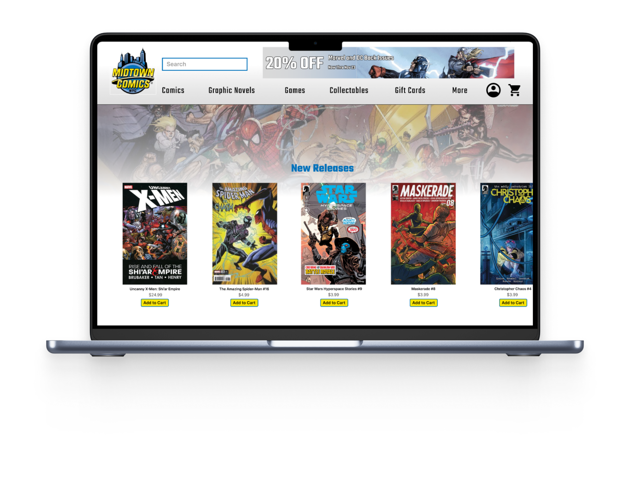
Redesigned Homepage
Designing and Prototyping
Color and type that matches brand experience
I began with the first most important question: what are you here to buy? And the result was unanimous - X:Men TP (Trade Paperbacks). Mike is following the latest series and is eager to preorder the newest editions and collections and that became priority for the prototype. The design is color and character forward, matching the brand and real world experience of walking into a comic shop.
The color palette is based on the primary colors you find in Superman, Spiderman, X-Men the animated series and the Midtown Comics logo.
Style Guide
Testing and Validation
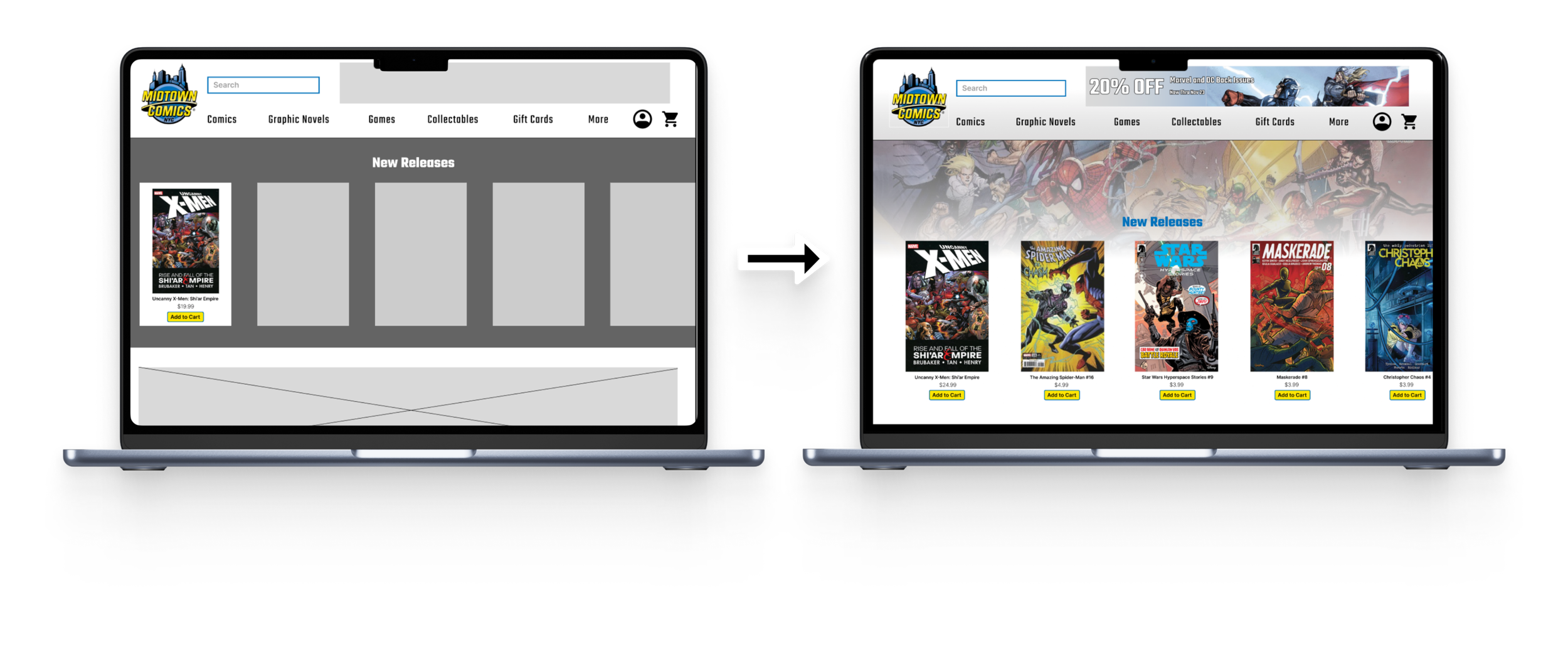
Greyscale to High Fidelity
The strongest changes from mid to high fidelity wireframes rested in the labeling of navigation and alphabetic drop down options, respectively. Additional feedback from the first round of usability testing indicated the desire for a more dynamic home page that escaped the monotony of rectangular confines.
4 out of 6 users prefered to search by “Title” instead of “Character.”
6 out of 6 users completed their task of finding a specific trade paperback in under 2 minutes.
All users found the new interface easier to navigate and less overwhelming.
Development and Implementation
Prototype
Mike and users like him value the use of color but don’t need it in excess, they are carefully attuned to labels and correct verbiage in relation to their field of expertise, and they enjoy playful and whimsical use of images - they like seeing their favorite characters represented.
Results
Heuristic Solutions for an Infinite Library
From research and synthesis to ideation and high fidelity prototyping, the culmination of this study was a vibrant and catered experience for the comic book reader and their specific needs. Initially my users were met with an overwhelming homepage, confusing navigation, and crowded heuristics - but through my hypothesis, research and design I was able to transform the flow of finding their favorite story and deliver them to their end game.
A key takeaway from my study: the expert comic reader is a fined tuned machine when it comes to searching and expediting material from any library. The best way to give them what they want quickly is to allow for fast and clear navigation that adheres to cannon and brand identity.
Next Steps
Filters to search by date, artist, and variant covers
Event promotions for scheduled readers and collectors
Pagination of libraries for screen reader accessibility
Bottom of homepage and footer
Product page and cart


